Portrait vs landscape: why product videos need a new composition
A practical guide to adapting a product demo for vertical and widescreen placements without relying on a simple crop.
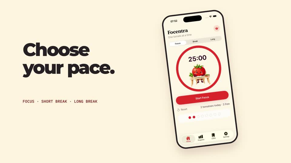 Related portfolio example: Focentra — One good session →
The same pixels serve different viewing habits
Portrait video is often watched on a phone held upright. Landscape video may sit beside copy on a product page or play in a wider frame. The app interface, type and action all compete for different amounts of space.
Recompose around the interface
A device mockup that feels readable in a wide frame may become tiny when cropped vertically. Rebuild the device scale and position, simplify secondary text, and keep the action within the frame. Design for the actual placement instead of assuming a crop will preserve the hierarchy.
Retune type and timing
Larger titles can dominate a portrait screen; landscape gives a longer horizontal line. Recheck line breaks, safe margins and how long each label stays on screen. Keep the message the same while adjusting its visual rhythm.
Use the Focentra edits as an example
The Focentra sample has a 20-second 9:16 cut and a separately composed 16:9 adaptation. The landscape edit has its framing and type scale rebuilt. This is a portfolio example of format-specific composition, not a claim that every brief requires two full versions.
Decide based on distribution
Ask where the video will appear, which format is required, and whether a second version has enough value to justify its scope. If both are needed, plan for them at the brief stage so the screen capture and graphic layout can support each.